 |
 | ||||||||||||||||
|
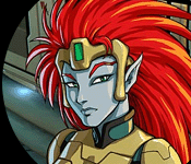
CG 102 - Page 2 Here we are, airbrushing away. I keep one hand on the Undo key (Crtl-Z) to erase the odd errant brush-stroke.
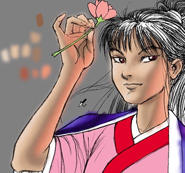
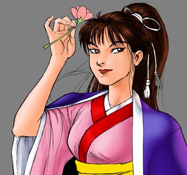
If things start to get a little splotchy, it can be smoothed out a little bit by using the Filter... Blur... Gaussian Blur function. Be careful when blurring, though... as hard shadows (like under her chin) may have to be re-emphasized after they are blurred. As you can see from the various splotches, I used a series of colors going from light to dark for both the primary (white) and secondary (reddish) light sources, blending between them to achieve a continuous shading effect.
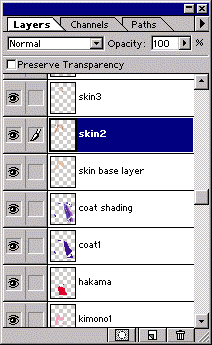
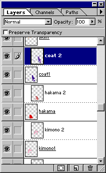
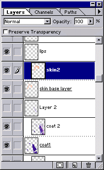
Now, to get rid of the paint outside the lines, I just group each shading layer with its corresponding base layer (Layer... Group with Previous or Ctrl-G), and *poof*! All clean and pretty, no overrun or palette splotches visible. Which is all well and good, except for one thing: I hated it. Even though I followed the reference image fairly closely, in this case the complex shading on the skin just didn't look right. For one thing, the shadows were just too harsh, but even more importantly, the realistic shading just doesn't complement the line drawing. Trying to apply too-realistic shading to a stylized line drawing can be counter-productive. American manga guru Adam Warren had this to say about shading on anime-style drawings: "Some colorists, who are used to detailed flesh tone rendering on more "realistic" faces, often try to render complex real-life facial structures (nasal bridges, eye sockets, cheekbones) on a manga-style face... with disastrous results. That's the main reason most manga are in black and white. Remember, with a "cutesy chick" face, you're dealing with hyperstylized topology that has zero relation to reality. I prefer to stick with the simple two- or three-tone approach to flesh tone shading used in decent-quality anime, a technique that is emulated with dot-pattern screentones in black-and-white manga." This certainly doesn't mean that you can't use rendered shading on a stylized character face, it does mean that if things aren't working out, it's best to keep it simple. As in many forms of art, it's important not to let attempts at "realism" interfere with making something look good. Fortunately, one of the best things about CG art is that it's never too late to change any part of the piece. So I looked at the work of a few anime-style artists that I know who have done really good airbrushed shading on stylized faces for ideas on how to fix this image. I ended up more or less redid the fleshtone shading, using warmer, softer colors, and using much less definition.
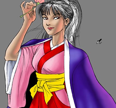
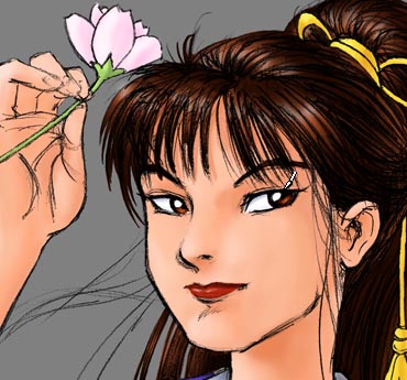
Ah, much better. While the effect of the reddish backlight in the previous version was nice, this particular piece works better without it. Don't let that discourage you from experimenting with multiple light sources, however. Anyhow, on with the show.
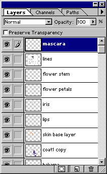
Filling out the minor colors, the gradient-iris technique mention in CG 101, and a few highlights to the hair, and we're almost done with the airbrush rendering part. But first, a word about eye-liner. Personally, I like thick dark eyelashes... and I've noticed that lashes that looked quite thick in a black-and-white line drawing suddenly look sparse after the pic is colored. So, I almost always have to add a "mascara" layer with a little black paintbrush to thicken up the lashes. Now for the cool kimono patterns. To Page 3! |