 |
 | ||||||||||||||||
|
CG 101: Basic Cel-Style Coloring in Photoshop 5.0 [posted 7/28/00] Here's a demonstration of how I do a fairly straightforward color CG illustration; in this example, I'll use the masthead illustration of Fireblade. The version of Photoshop used is 5.0, but since these operations are pretty basic, any recent version should do. I make heavy use of layers; others prefer channels, which work in much the same way. This tutorial is not intended as a recommendation of how to do things, but rather as a description of how I work. There's no one right way to achieve any effect. This piece began life as a pencil sketch on a piece of ordinary, everyday office copier paper. I use office copier paper for general sketching more often than I use dedicated sketch paper; I have the big, expensive stuff for later stages of the process.
Usually my sketches are fairly messy, so I can rarely use the original sketch as-is. If the pencil is fairly clean, I can ink right over the top of it; otherwise, I have to trace and redraw it on another piece of paper (which is what I did here). If the pencil is clean enough, or you want a rough style, you can go ahead and use the pencil as your linework. If I'm really serious about the inking, I sometimes use Bristol or other, fancier paper that holds the ink better. But in this case, I redrew the sketch onto a sketch pad, and inked right on the sketch paper with Micron Pigma pens, and then scanned it in. I usually scan at about 200 dpi for an image that's intended for the Web, and 300 dpi or higher for something that's destined for print. Web images are displayed at about 72 dpi, but I work larger so that I can shrink it down at the end and not lose any detail.
As I work, I always make many incremental saves under different names (Fireblade1.psd, Fireblade2.psd, etc.) because you never know when you're going to change your mind or have a system crash. No matter how many saves I make, there's always a point where I wish I'd made at least one more. And disk space is cheap these days, right?
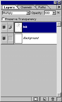
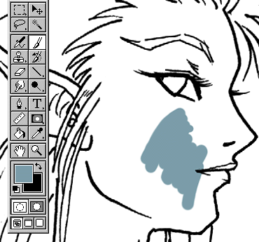
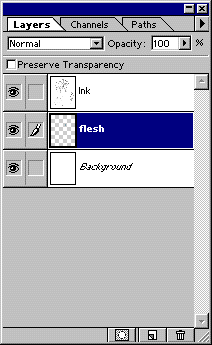
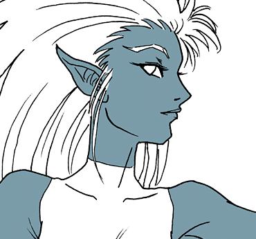
To apply color, I create a new layer between the Ink and the Background. I start with the base skin color (blue in this case) and begin filling in the lines of a particular area using the paintbrush tool. Since I'm working on a layer below the linework, the color appears behind it like paint on the back of a cel. I use a Wacom tablet for coloring, although it can also be done effectively with a mouse.
Getting the exact color right isn't important here, because it can be changed later. What's important is carefully staying inside the lines, because this base color layer is going to be the guide for the various shading and highlight layers to come later. Onward! To Page 2! |